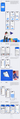
Figma
Adobe Photoshop / Illustrator
Miro / FigJam
AI: ChatGPT, MidJourney, Freepik, Krea, Figma AI, Notion AI etc.
Adobe Photoshop / Illustrator
Miro / FigJam
AI: ChatGPT, MidJourney, Freepik, Krea, Figma AI, Notion AI etc.
Programs — Programs — Programs — Programs
P-S
Select the most accurate references
Generate creative ideas
Quickly reserch to answer any question
Layout in html + css, work on no-code services
Generate creative ideas
Quickly reserch to answer any question
Layout in html + css, work on no-code services
What I can do — What I can do — What I can do — What I can do
WID
UI/UX design
Mobile design
No-code development
Typography
AI-assisted design workflow
Mobile design
No-code development
Typography
AI-assisted design workflow
Skills — Skills — Skills — Skills
S
Read art books and go to exhibitions
Experiment in graphic design, discovering new styles for myself
Tell jokes*
Experiment in graphic design, discovering new styles for myself
Tell jokes*
What I like to do — What I like to do — What I like to do — What I like to do
L
*for impulse. Rare.
20 years old, multidisciplinary designer and (sometimes) drawing
in digital. I currently work as a freelance designer and I have experience in brand identity, mobile design and UX research
in digital. I currently work as a freelance designer and I have experience in brand identity, mobile design and UX research
Work Experience
2021-2023
Freelance
2023-2024
Business Booster
multidisciplinary designer


Resume
Figma
Miro / FigJam
AI: ChatGPT, MidJourney, Freepik, Krea, Figma AI, Notion AI etc.
Adobe Photoshop / Illustrator
Programs:
What I can do:
Select the most accurate references
Generate creative ideas
Quickly reserch to answer any question
Layout in html + css, work on no-code servicesMiro / FigJam
Skills:
UI/UX design
No-code development
Typography
AI-assisted design workflow
Mobile design
What I like to do:
Read art books and go to exhibitions
Experiment in graphic design, discovering new styles for myself
Tell jokes*
*for impulse. Rare.

Dribbble shots
A small block in which my shots are collected, laid out on the Dribbble platform
Main responsibilities:
Main responsibilities: complete rebranding of company materials in accordance with the corporate style, finalization of the corporate style
complete rebranding of company materials in accordance with the corporate style, finalization of the corporate style
What was done?


link 1
link 2
· Redesigned and improved landing page interfaces (UX/UI - 70% of the total work);
· Assisted with the development of new product releases and the design of advertising creatives;
· Designed presentations (client and corporate), email newsletters, banners for social media and messengers;
· Closely collaborated with the marketing and development teams, discussing and implementing design ideas to increase website reach and sales conversion;
· Helped structure and sort all brand materials;
· Worked daily with AI tools and implemented several new ones in the company
Complete rebranding of company materials in accordance with the corporate style, refinement of the corporate style
link 3
Rebranding of the
Business Booster company
Business Booster company
I've been working on a complete rebranding of all of Business Booster's materials. I can't publish many of these materials due to NDA, but I'll present what's already been published.
*It's worth emphasizing that I didn't work on the text content. That was handled by the company's marketers.
(these are banners)
(these are stories)
(this is lead magnet)
My responsibilities included a complete rebranding of all the company's visual materials, including websites, promotions, lead magnets, banners, presentations, and even stories. The visual concept had been chosen before me, but with my help, it became more minimalist and more conversion-oriented. But first and foremost, I specialize in websites, so about 500 different landing pages and multi-page websites were completely redesigned, and here are just a few of them:
Моя работа заключалась в создании разных дизайн-материалов для компании. Всего было созданно около 300 баннеров, 40 презентаций, справочных материалов и лид-магнитов. Для меня было важным сохранять стилистику компаниии, снижать текстовую нагруженность и делать акцент на смыслах. И это помогло - почти каждая рекламная компания сохраняла высокую конверсию продаж или повышала её.
My job involved creating various design materials for the company. In total, I created about 300 banners, 40 presentations, reference materials, and lead magnets. It was important for me to maintain the company's style, reduce text overload, and emphasize the message. And it worked—almost every advertising campaign maintained or increased high sales conversion rates.
Main responsibilities:
Main responsibilities: complete rebranding of company materials in accordance with the corporate style, finalization of the corporate style
complete rebranding of company materials in accordance with the corporate style, finalization of the corporate style
What was done?
Sites
Brand materials
The main task:
What was done:
To summarize:


Archive
Here are all the old works that I find quite interesting to view. Each one is important to me, and together they give an idea of my skills.
Goal:
Key Idea:
The website combines informational, promotional, and commercial functions: introducing the band, tour announcements, and presenting albums and merchandise.
Conveying Alt-J's musical multilayeredness through a minimalist and structured visual system.
The interface is built on a contrast between simplicity and experimentation, where every element supports a sense of rhythm and sonic dynamics.
Create an intuitive, visually cohesive, and emotionally engaging interface that reflects the band's aesthetic and provides convenient access to information about tours, albums, and merchandise.
Goal:
Key Idea:
The design is based on the concept of urban contrast—a combination of rough textures, dynamic typography, and modern digital clarity. The interface conveys the spirit of street freedom and self-identity characteristic of the festival, where visual energy supports a sense of movement, drive, and lively connection with the audience.
To reflect the energy of local street culture and combine information about events, artists, and partners into a single visual system.
Сomment:
The organizers really liked this layout and received positive feedback. My most unusual, yet beautiful, case.
The website combines the structure of an online magazine with the aesthetics of a creative media space.
№1: Website for the Alt-J (musical band)
№2: Locals Only (fest)
Goal:
Key Idea:
A minimalist modular grid with accents of color and typography, where each section is perceived as an independent block while maintaining the integrity of the interface. The main goal is ease of navigation and visual expressiveness, reflecting the spirit of a modern cultural center.
Create a responsive and intuitive landing page for the Zero Room art space that concisely presents all key information—events, residents, and contact information—in a single visual block.
№4: Zero Room
Goal:
Key Idea:
The core concept is a combination of functional minimalism and expressive color accents, reflecting the energy of contemporary digital design. The interface is built around the principles of visual hierarchy and ease of perception: every element is subordinated to the idea of purity of form and ease of navigation.
To create a design concept for the news website "New Mag," dedicated to contemporary design, technology, and the creative industry. The project's goal was to develop a user-friendly, visually clean, and emotionally inspiring platform for designers and creative professionals, where content becomes the central element of interaction.
Сomment:
Was created for the competition at the site itself and took an honorable second place)
№3: News site for Dribbble
It doesn’t push users to match — it helps them find real connections based on shared values, interests, and moods. It’s a place where everyone can simply be themselves and still feel seen and valued.
"Just Match" blends technology with humanity.
Key Idea:
Trust & Safety — communication features are built around respect and personal boundaries.
Emotional Warmth — the design fosters a sense of openness, friendliness, and lightness.
Simplicity — meeting someone should be effortless and enjoyable, not overwhelming.
Individuality — each user is unique; the recommendation system highlights their true personality.
Core Meanings:
To create a next-generation dating app where users feel natural, comfortable, and safe while meeting new people.
The aim is not just to connect individuals but to build a space for genuine communication, where quality and emotion matter more than endless swiping.
Goal:
Just Match app
Just Match — a dating search app. It differs from the classic dating app in that it complicates dumpscrolling and emphasizes personality — so it adds detailed profile descriptions, interests
and stories
and stories
The app evokes freshness, sincerity, and comfort. The blue-and-white color palette symbolizes trust, calmness, and clarity. Friendly 3D illustrations and soft shapes in the UI reflect ease and warmth
in interaction. "Just Match" is not just an app — it’s a feeling of connection, a simple and confident step toward meaningful relationships.
in interaction. "Just Match" is not just an app — it’s a feeling of connection, a simple and confident step toward meaningful relationships.
And now very briefly about each block:
Для меня было важно создать визуально приятный и понятный интерфейс, который бы отражал новую ветвь знакомств поколения з. Люди устают от быстрого скроллинга и ценят идентичность, поэтому в этом проекте для меня было важном создать максимально простые и адаптивные инструменты для раскрытия именно личности. Писать о себе, выкладывать контент, подчеркивающий повседневную жизнь, быть на виду. Создавать комьюнити, ценящее реальные взаимодействия.
It was important for me to create a visually pleasing and intuitive interface that would reflect the new branch of dating gen Z. People get tired of fast scrolling and value identity, so in this project it was important for me to create the simplest and most adaptive tools to reveal exactly the personality. Write about yourself, post content that highlights everyday life, and be visible. Create a community that values real interactions.